Atari Licensed T-Shirt: A Modern Take on a Classic Logo

Introduction
Atari is one of the defining names of early video games. Founded in 1972 by Nolan Bushnell and Ted Dabney, the company helped shape the arcade era and the rise of home consoles in the 1970s and 1980s, leaving behind a catalogue of instantly recognisable classics. Over time, the business changed hands and the industry moved on, but the Atari name and logo stayed culturally “alive” as shorthand for retro gaming and nostalgia.
This article looks at a modern Atari-branded T-shirt that leans into that legacy with unusually bold, high-contrast styling. It’s not a subtle nod or a tiny chest emblem: the branding is front-and-centre, graphic, and confident in a way that feels distinctly Atari. In the sections that follow, we’ll describe the garment and its key details, share the curator’s notes from wearing and examining it in-hand, and finish with a photo gallery showing the actual shirt owned by the curator.
Description
This Atari-branded T-shirt is visually assertive and deliberately graphic. The garment uses a white body as a neutral field, capped with a deep blue shoulder and upper chest panel that immediately frames the logo area. Centred on the torso is a large, rectangular Atari mark rendered in red, white, and blue, with the word “ATARI” set boldly beneath. The scale of the print leaves no ambiguity about what the shirt represents — this is branding worn openly rather than hinted at.
The Atari logo itself originated in the early 1970s and is often described as representing the profile of a stylised letter “A” or the centre line and uprights of a Pong court. Its strength lies in symmetry, simplicity, and instant recognisability. On this T-shirt, the logo geometry remains faithful to the official mark, preserving the characteristic curved uprights and proportions. What changes is the colour treatment: instead of the more familiar monochrome or solid fills, the logo is split into bold colour blocks, giving it a sports-emblem feel that is less typical of classic Atari presentation.
Additional branding appears inside the collar, where the Atari logo and wordmark are printed cleanly alongside size information. This interior mark aligns closely with official brand guidelines and reinforces that this is a licensed product, even as the front graphic pushes the logo into a louder, more fashion-forward context.
Curator’s Notes
I didn’t have strong expectations about how other people would react to this T-shirt. It’s such a loud, confident piece that my main motivation was simply to wear it and visually call out. The broad blue upper panel and striking central logo immediately appealed to me, and it wasn’t until later that I consciously registered the baseball-style layout it echoes.
What I enjoy most is that the shirt doesn’t take itself too seriously. It clearly calls out Atari, but it does so in a playful way rather than as a strict exercise in retro accuracy. While I don’t personally recall the Atari logo being presented inside a coloured box like this, the use of the original Atari font is a respectful and authentic touch that grounds the design. The colour palette itself feels very 1980s, which suits the brand and the nostalgia it carries.
I purchased this T-shirt in 2019, and seven years later it’s long worn out — a good indication of how often I reached for it. The colours pair easily with other casual clothing, but my default was always simple: jeans and the shirt, nothing formal. Some garments are about statement and comfort rather than polish, and this one sits firmly in that category.
Gallery
This T-shirt was purchased by the curator in 2019 and photographed in-hand. All images show the actual garment owned, worn, and examined by the curator.

This image shows the complete front of the Atari T-shirt laid flat, making the overall design language immediately clear. The white body is sharply contrasted by the deep blue shoulder panel, which frames the neckline and upper chest. The central graphic dominates the garment: a large, boxed Atari logo rendered in red, white, and blue, with the familiar ATARI wordmark set prominently beneath. The scale of the logo and the strong colour separation give the shirt a bold, almost sports-jersey presence, leaving no ambiguity about its branding or intent.

This closer crop focuses on the central chest graphic, where the Atari branding does most of its visual work. The familiar Atari “Fuji” symbol is enclosed within a rounded rectangular frame and split into bold red, white, and blue fields, a treatment that departs from the more common single-colour presentations of the logo. Despite this variation, the proportions and curves of the mark remain faithful to the original design, ensuring it is instantly recognisable.
Beneath the symbol, the ATARI wordmark appears in the classic corporate typeface. Its inclusion anchors the design in official branding and prevents the coloured emblem from drifting into parody or pastiche. The result is a graphic that feels both playful and legitimate — a modern reinterpretation that respects the original logo while adapting it to a louder, fashion-led context.
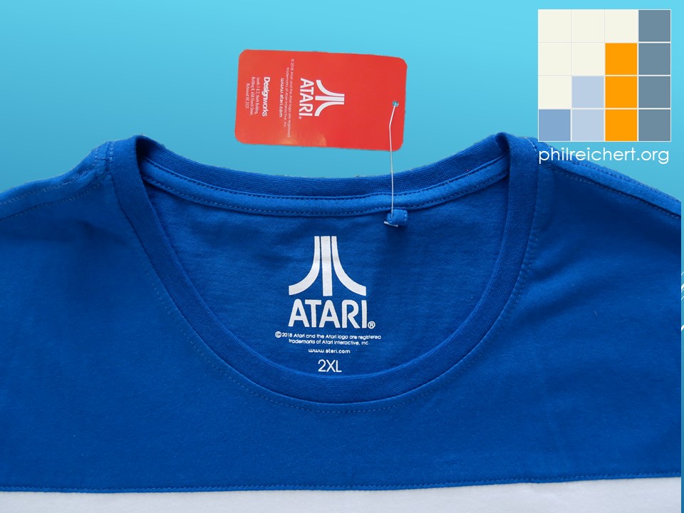
This image focuses on the inside of the collar, where the branding shifts from bold display to quiet confirmation. The Atari logo and wordmark are printed directly onto the fabric, accompanied by size information, keeping the interior clean and comfortable to wear. Above the neckline sits the red Atari authenticity swing tag, which identifies the garment as an officially licensed product rather than an unbranded homage or aftermarket print.
Together, the internal print and the authenticity tag reinforce the legitimacy of the shirt. While the front design plays with colour and scale in a more expressive, fashion-led way, the interior markings stay close to standard Atari brand presentation. This contrast helps anchor the louder exterior graphics in recognised, official branding, giving the T-shirt credibility as well as visual impact.
Angry Alien™ Review

Ah. Humans announce loyalty using fabric rectangles. This one shouts ATARI in large friendly letters, as if the wearer fears being mistaken for a Nintendo sympathiser. Sensible precaution.
The colours are bold. Blue. White. Red. This suggests sport, competition, and ritual chanting, yet the symbol represents ancient electronic paddles hitting a square dot. I find this historical layering amusing.
The logo is authentic. This matters to humans. Without authenticity tags, social standing collapses and conversations become awkward. I approve of the internal markings. They whisper “licensed” while the front yells.
Humans wearing this garment wish to appear relaxed, nostalgic, and slightly loud, but not dangerous. Jeans recommended. Formal occasions forbidden. Angry Alien badge awarded for surviving the alien invasion.

Frequently asked questions
Is this an officially licensed Atari product?
Yes. The T-shirt includes official Atari branding and an authenticity tag, confirming it is a licensed product rather than an unapproved reproduction.
Why does the logo use a coloured box?
The coloured box is a modern graphic treatment rather than a classic Atari presentation. While the logo’s geometry and typography remain faithful to the original, the colour blocking gives the design a louder, sports-style aesthetic.
Is this meant as a collector’s item or casual wear?
This T-shirt is best understood as casual wear rather than a display-only collector’s piece. It is designed to be worn and styled informally while still carrying authentic Atari branding.
When was this T-shirt purchased?
The T-shirt was purchased by the curator in 2019 and worn regularly over several years.