The Miscellaneum 003 – The Merchandising Special
Editorial
The first piece of merchandising I remember properly loving wasn’t a T-shirt or a toy tied to a TV show. It was a yo-yo.
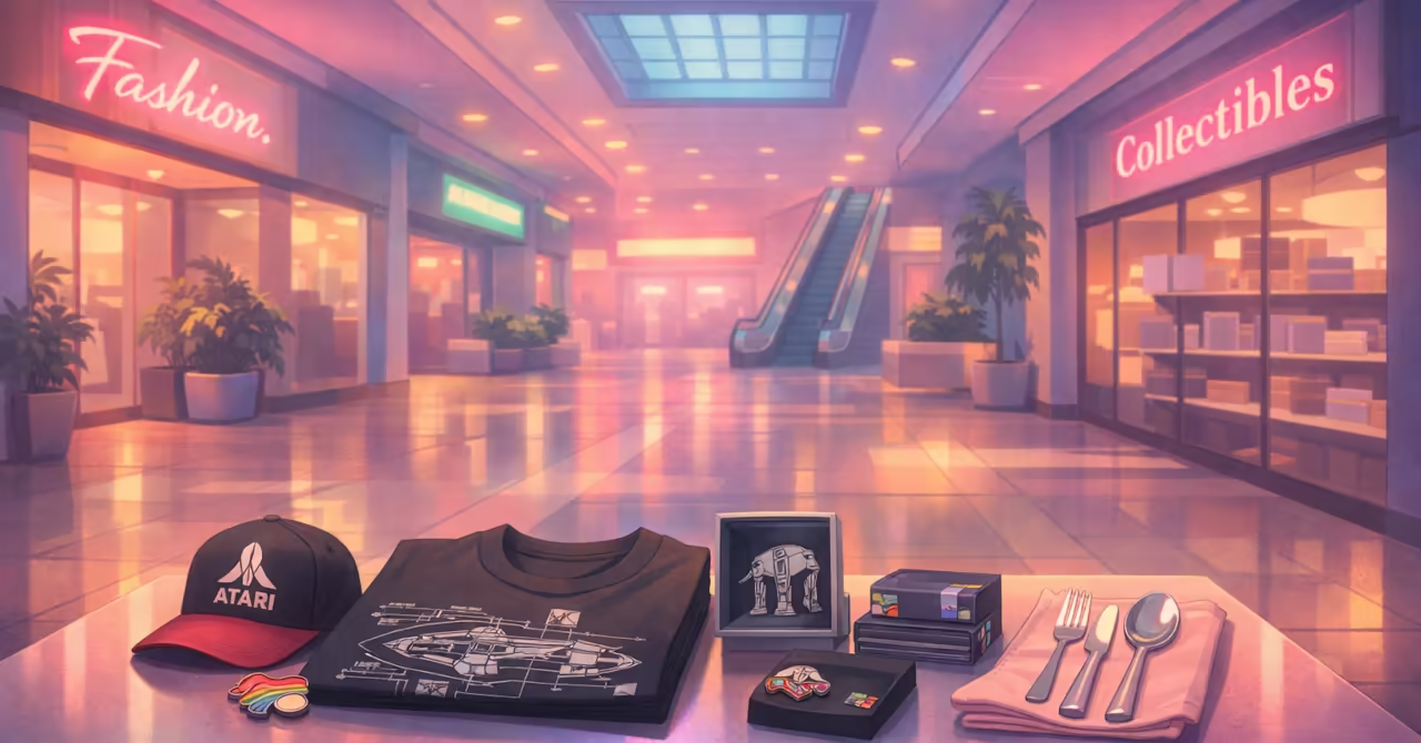
Not just any yo-yo either. The good ones were Coca-Cola branded. Everyone knew it. They were better made, spun longer, and felt right in the hand. We learned tricks like rocking the cradle, competed in the schoolyard, and at one point even had expert demonstrators come in to show us what a yo-yo could really do. It was excellent marketing, of course, but it worked because the object itself worked. The brand wasn’t doing the heavy lifting alone. The quality was.
That memory has stayed with me, and it turns out to be a useful one.
When you look at merchandising today, especially around long-lived cultural properties, the difference between something that merely carries a logo and something that earns its place in your life is still remarkably clear. Licensed products, particularly from older and well-managed intellectual properties, tend to be better thought through. Materials improve. Design restraint creeps in. Corners are less aggressively cut. Experience has taught brand owners that flooding the market with junk burns trust faster than it generates revenue.
That’s why I pay attention to licence cards and provenance when I photograph items for the site. Where licensing details are available, I note them explicitly, as they often correlate with material quality and design intent. Not because I collect for resale or future value — I don’t — but because those small signals usually correlate with care. And care is what turns an object from clutter into something you actually want to use.
I’m not a collector in the storage-and-archive sense. My shelves aren’t an investment portfolio. The website is the display cabinet, and the items themselves are there to be handled, worn, used, and enjoyed. My returns are memory-based. If an object continues to reward attention through use, design detail, or quiet competence, it has already paid for itself.
I learned this again through vintage computing. The speculative phase has largely passed. Commodore and Amiga machines were bought, priced, assessed, and traded, and for many people that was the point. It never really worked for me. These days, I keep my original machines for happiness reasons, while modern emulation gives me the experience without the fragility. The joy is preserved. The friction is reduced.
Merchandising works the same way. Yes, it often costs more now, but when quality rises with price, the nostalgia hit is still there. Seeing the Atari logo can still press the same Space Invaders joy button, without needing twenty cents and a long walk to the fish-and-chip shop arcade.
I also don’t buy items for the site. I buy things because I like them. Sometimes I know an article will follow. The Space Invaders T-shirt is a good example. Other times, the writing comes later, or not at all. And occasionally, the act of writing reveals things I hadn’t consciously noticed at purchase. Design decisions. Material choices. Quiet respect for the audience. Some objects, it turns out, curate themselves over time.
What surprised me most while expanding the merchandising coverage on PhilReichert.org was how much it sharpened my own voice. Spending time again with these objects, reflecting on them, disclosing why they appealed, and being honest about their limits turned out to be the real pleasure. Not the acquisition, but the attention.
And that, I think, is where merchandising stops being just product and starts becoming something worth writing about.

New Pages


Site Updates


In The Margins
Kitschification
- Meaning
- The process by which an object, image, or idea is transformed into kitsch through exaggeration, repetition, sentimental styling, or mass reproduction; often involving the reduction of complex cultural meaning into something playful, ironic, or easily consumable.
- Pronunciation (Australian English)
- /ˌkɪtʃɪfɪˈkeɪʃən/ “kit-chih-fuh-KAY-shun”
- In a sentence
- The repeated use of the character’s logo across novelty items marked the final kitschification of what had once been a sharp and subversive design.
- Why use it (rather than “kitsch”, “commercialisation”, or “novelty”)
-
- Kitschification describes a process, not just an aesthetic outcome.
- Kitsch names the end state but not how something arrived there.
- Commercialisation is economically accurate but culturally blunt.
- Novelty suggests lightness, without acknowledging loss of depth or intent.
- Miscellaneum note
- The term is useful when thinking about long-lived intellectual property and merchandising, where repetition and familiarity can tip carefully designed symbols into self-parody. Not all kitschification is failure, though. In some cases, it becomes a second life for cultural icons, trading seriousness for accessibility and shared nostalgia.
Web Finds
- DIME Magazine – A Japanese magazine aimed at the modern salaryman, blending consumer news, lifestyle updates, and cultural trends. Reading it untranslated adds an extra layer of adventure, turning everyday topics into an exercise in discovery, pattern recognition, and cultural immersion. Recommended for curious readers who enjoy learning by wandering.
- The Fortune Teller – A quirky, coin-operated digital fortune teller with a conscience. Styled like a novelty machine but driven by environmental messaging, it asks visitors to slow down, listen, and reflect. Keep an open mind and let it speak; the message is often gentler, and sharper, than expected.
- The Posters of Peter Strausfeld – A look at the distinctive linocut poster work of Peter Strausfeld, whose bold textures and graphic restraint give his designs a timeless, tactile quality. Linocut has a particular visual authority, and this article is worth bookmarking if you’re thinking about developing a strong, repeatable visual language of your own.
Paper Games
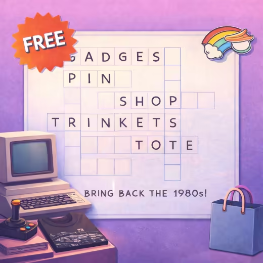
(no registration required)
Creator's Log
A few notes from the workshop: what's been fixed, improved, or learned on the road to keeping this site fast, useful, and brimming with curiosities.
- Building Topical Density, Not Just Better Pages
- Over time I’ve learned that improving a website isn’t always about writing better individual articles. Sometimes it’s about helping search engines, and readers, understand how those articles relate to one another. Google talks about this in terms of topical density, and the idea has increasingly shaped how I plan and publish content. This issue grew out of revisiting some of my oldest pages, many of which sit around retro-gaming fashion and merchandise. As I updated them, patterns emerged. I realised I had a queue of related drafts and notes sitting idle, simply because they hadn’t been framed as part of a broader theme. By pulling those threads together, I was able to create a newsletter that is both cohesive and genuinely interesting, not because each article is perfect in isolation, but because they reinforce one another. Focusing on topical density turned a set of loose updates into a confident editorial package.
- Experience, Voice, and My Practical View of EEAT
- Google’s emphasis on EEAT has also changed how I think about publishing. I used to assume that writing clear, well-researched articles was enough. It still matters, but it isn’t the whole story. Increasingly, what carries weight is the author’s voice and the credibility of lived experience. My site is not trying to be the most scientifically authoritative resource, nor am I aiming to operate as an influencer. What I care about is sharing real experiences and curating moments of enjoyment. That means being honest about why I like something, how I use it, and where its limits are. As I’ve leaned into that approach, my writing has become more personal and more consistent. Specials like this one emerge naturally from that process. Over time, I believe this experiential voice builds trust, not through claims of expertise, but through continuity, disclosure, and the simple act of paying attention.